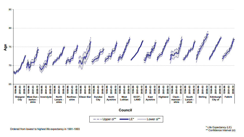
5.1.1 Figure 5 shows how male life expectancy within Council areas has changed since 1991-1993, with Council areas ordered from left to right by the lowest to highest life expectancy in 1991-1993.
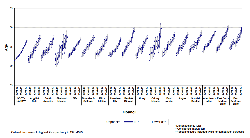
5.1.2 Figure 6 shows how female life expectancy has also changed within Council areas since 1991-1993, with Council areas ordered from left to right by the lowest to highest life expectancy in 1991-1993.
5.1.3 Table 3 and Table 4 compare male and female life expectancies in 2010-2012 with those for 2000-2002 and 2005-2007 and give rankings for each area in the respective years. Comparisons made between these rankings should be treated with caution and do not imply differences in life expectancy.
5.1.4 Male life expectancy has risen in all Council areas since 2000-2002, with the biggest increase of 5.7 per cent (4.3 years) being in Orkney Islands. Female life expectancy has increased in most Council areas since 2000-2002. In Shetland Islands there was a small decrease but this was not significant (Section 2.2). East Dunbartonshire Council saw the biggest rise in female life expectancy, increasing by 3.6 per cent (2.9 years).
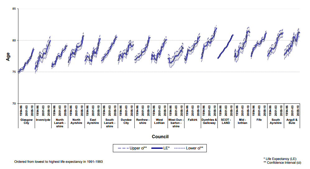
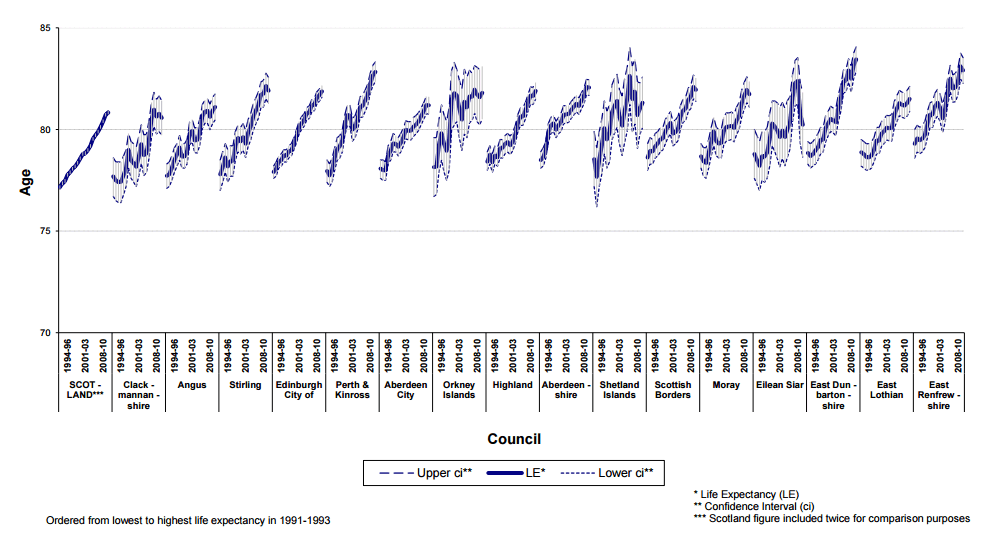
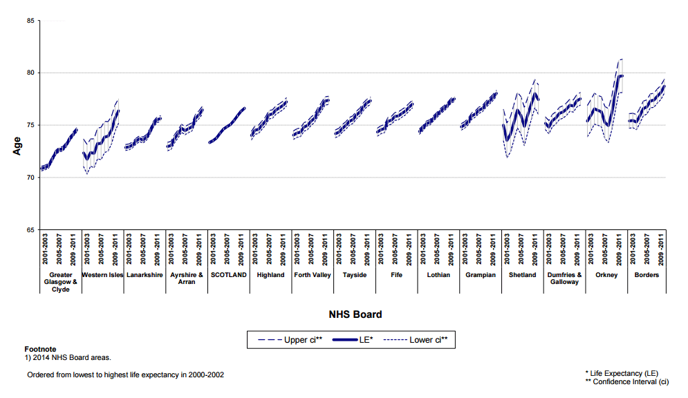
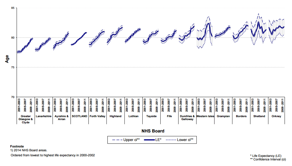
5.2.1 Figure 7 shows how male life expectancy has changed in NHS Board areas since 2000-2002 and is ordered from left to right by the lowest to highest life expectancy in 2000-2002. Figure 8 shows the same information for female life expectancy in NHS Board areas. Time series presented starts at 2000-2002 because life expectancy estimates for earlier years at new 2014 NHS Board area level are not currently available.
5.2.2 Table 3 and Table 4 compare male and female life expectancies in 2010-2012 with those for 2000-2002 and 2005-2007 and give rankings for each area in the respective years. Comparisons made between these rankings are subject to the margin of error within the life expectancy estimates.
5.2.3 Male life expectancy has risen in all NHS Board areas since 2000-2002, with Orkney showing the biggest improvement, increasing by 5.7 per cent (4.3 years). Although male life expectancy in Greater Glasgow & Clyde remained at the same ranking of 14, it was third in terms of improvement, having increased by 5.2 per cent (3.7 years) since 2000-2002.
5.2.4 Female life expectancy increased in all areas except in Shetland where there were no significant changes (Section 2.2). Highland NHS Board saw the biggest improvement, rising by 3.2 per cent (2.5 years).